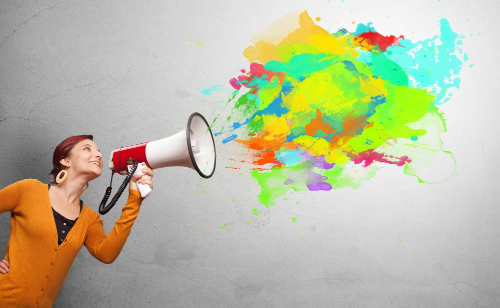
You already know that colors are associated with basic emotions--red represents anger, blue encapsulates sadness, and so on. But did you know these colors can have a subtle effect on your mood?
Perhaps you're looking to paint the walls of your law office or achieve a certain aesthetic at home. Or maybe you are building an online presence for your brand and choosing a color palette that will suit your firm, but having trouble settling on a particular choice. It's time to take the power of color psychology into your hands! Read on to learn what each color represents and how to make it work for you.
Red. Red is one of the most vibrant, attention-capturing colors out there and it can signal a wide variety of things: anger, danger, health, passion, and love to name a few. We can see these meanings reflected in stop signs, the cross of hospitals, and classic red hearts.
There have been studies done surrounding the color red. When in competition, those wearing red have a slightly higher win rate because the color exudes dominance and confidence. However, it is also a sign of aggression, so if you're headed to an interview or meeting a client for the first time, perhaps consider wearing something a little less dramatic.
Finally, red is said to stimulate appetite, making it a popular color to place in your kitchen. This also makes it a popular choice for food and drink brands. It is the sort of color that moves one to action.

Orange. Much like the fruit, the color orange is a refreshing, stimulating color that captures feelings of warmth, energy, and creativity. It's similar to red and a good way to garner attention, but in a less obtrusive and demanding way.
Since it promotes energy, it's a good choice to incorporate orange into a room that serves as a social setting or website. Orange would be perfect for a deposition room as it encourages the lines of communication to be open.
However, too much orange can be overwhelming and stressful, so be sure to use it in moderation.

Yellow. The color of sunshine is a bright, cheerful color that is eye-catching and inviting. It evokes feelings of happiness and positivity, but can also be used in messages of caution or warning (think of yellow street lights and signs).
Yellow's brightness can lend itself to being stressful on the eye, so this is another color best used in moderation. It's a good choice to use in business and branding, but don't use too much of it.

Green. Green is the color of nature (and wealth). It signifies growth and promotes feelings of peace, harmony, security, and mental health, making it a great option for wall paint. In television, there is something called a "green room," which is the room guests wait in before going on a show. Its green walls are meant to reduce anxiety and enhance focus. If you'd like to put your clients at ease when they visit your office, green may be a smart choice.
Considering its symbolism, green is a popular choice in business and branding. If you practice business law, a green logo may be the way to go since businesses always strive for growth and wealth.
It also gives off the feeling of freshness and a concern for the environment (Go Green)! No matter the shade you choose, green gets the job done.

Blue. Another color found commonly in nature, with ties to both the sky and water, blue has a calming effect, which makes it a great choice for a bedroom or perhaps a waiting room. It also symbolizes stability, harmony, and trust, making it another solid choice for your firm's logo or color palette. It certainly seems to be a popular choice for many social media brands.
However, blue also carries connotations of coldness and depression. Think carefully about which shade of blue speaks to you in a positive way before making a decision.

Purple. The color of royalty, purple is elegant, sophisticated, and unique. The combination of fiery red and calming blue, it balances warm with cool, and inspires a sense of mystery and inspiration. It's a rare color in nature and a popular choice as an accent color. It can uplift your spirits as well as calm your mind, making it a great color for a bedroom.
The fact is more women prefer purple than men; the lighter shades are particularly associated with femininity. Still, it's a solid choice for a color palette in marketing, particularly for those who want their customers and clients to feel like royalty. Perhaps purple could be the right fit for you if you're looking for that luxurious vibe.
%20in%20garden%2c%20spring%20in%20northern%20Illinois.jpeg?width=1000&name=Pasque%20flower%20(binomial%20name%20Pulsatilla%20vulgaris)%20in%20garden%2c%20spring%20in%20northern%20Illinois.jpeg)
Pink. Though it has been associated with femininity for years, pink is a fun, playful color that is becoming more and more popular in branding and decorating. Soft pink hues portray a relaxed youthfulness and calmness. It's even used to influence prison inmates and rival football teams.
While soft pink is sweet and gentle, hot pink is loud and eye-catching. It has many strengths that can be utilized and is much more than just "a color for girls" (in fact, it used to be the other way around). All in all, pink is a great choice if you want to stand out in a crowd.

Black. This bold color represents power, mystery, professionalism, and authority. You can make it pop or utilize it as a background to help other colors pop. It's a popular color in retail and as text because it's easy to read. Logos that use black are looking to make a powerful statement and convey how strong and serious they are--a great selection for any law firm.
Interestingly, a number of fashion brands opt for black. It is simple, yet glamorous--a color that works well with every other color.

White. This neutral color walks a fine line between sterile and pure. It is the color associated with new beginnings and fresh starts, like a blank piece of paper with potential for a drawing or written words. It contains positive connotations in many societies. In branding, it can work as a simple background or help provide contrast.
If you're looking to incorporate it into your house, it can create a sense of space and help a room feel bigger. Putting white in a room calms, balances, declutters, and brings clarity. However, too much can strain your eyes, and become bland, cold, or unfriendly. Variety is the spice of life; white is the perfect blank canvas to begin painting other colors on. Much like black, it gets along well with any other color on the spectrum.

Brown. This earthy tone enshrouds comfort, stability, and relatability, considering it is the color of wood, earth, and stone. Rich browns especially produce warmth and feelings of comfort. If you want to convey to customers that your firm is reliable and down to earth, brown may be the option for you.
However, keep in mind that it can easily be perceived as boring and dull since it isn't the most energetic of choices. While it may not make a great option for sports uniforms, it would be great to paint the walls of your firm's study or library in order to promote a calm focus.

This is merely scraping the surface of the impressive power of color psychology. Each shade on the spectrum can produce different feelings and convey many meanings. Not to mention all of the endless combinations that can be created from there.
Now that you know the basic meanings of each color, weave them into your life and see what works best for you!

COMMENTS